Census 2021 · TS021 · England + Wales
Building the
Dot Density Map
From raw census counts to interactive vector tiles. Six chapters on the decisions behind the data, the geometry, and the interface.
From Census to Counts
The raw material is the 2021 Census, published by the Office for National Statistics. For the Ethnicity table (TS021 6a), counts are released at Output Area level — the finest census geography in England and Wales, typically 100–600 people. Each of England and Wales's 188,000 OAs carries a population count for five categories: Asian, Black, Mixed, White, and Other.
Building the Vector Tile Pyramid
OA boundaries are loaded from the ONS shapefile in British National Grid (EPSG:27700) and reprojected to WGS84 before geometry work — the coordinate system Tippecanoe expects. Points are rejection-sampled inside each OA polygon across 8 parallel cores (~23,000 OAs per chunk). Each point carries one property: {"cat": 0–4}.
Ratio polygons are written as GeoJSONSeq (.ndjson) — one feature per line, no wrapping FeatureCollection. Tippecanoe runs twice with -Z8 -z14 -B13 --no-tile-compression --read-parallel: once for the dots layer, once for the ratio polygons with --simplification=10 --simplify-only-low-zooms. Each dataset also emits a config.json with normalised category ratios.
Normalised Relative Ratios
Raw counts are converted to ratios anchored to the nationally largest group. White (81.7% nationally) is set to 100; all other groups scale proportionally — Asian ≈ 11, Black ≈ 5, Mixed ≈ 3, Other ≈ 3. These baselines live in config.json and drive the legend bars at load time.
When a user selects an OA, the OA's own ratio vector is pulled from the tile feature properties and normalised to its local maximum, enabling instant comparison against the national baseline.
Screen-Relative Dot Size
Each dot is a MapLibre GL circle layer. Rather than fixing the radius in absolute pixels — which collapses on Retina displays and overshoots on small viewports — the radius is computed as a fraction of the shorter viewport dimension:radius = dscale × min(W, H) / 200
A slider controls dscale in the range 0.04–0.4. A resize listener recomputes on every window change, keeping dot density consistent across devices and orientations.
Three Ways to Explore
Three distinct modes let users interrogate the data at different granularities.
Click to inspect. Selecting any OA reads its ratio vector from the polygon tile feature properties, highlights the area in red, and updates the legend in place.
Freedraw. Tracing a polygon on the map identifies all OAs whose centroids fall inside it via point-in-polygon ray-casting. Their ratios are summed and normalised to produce an aggregate profile of the drawn area.
Page average. MapLibre's queryRenderedFeatures counts all visible dots by category integer in real time — reflecting the ethnic mix of whatever is currently on screen.
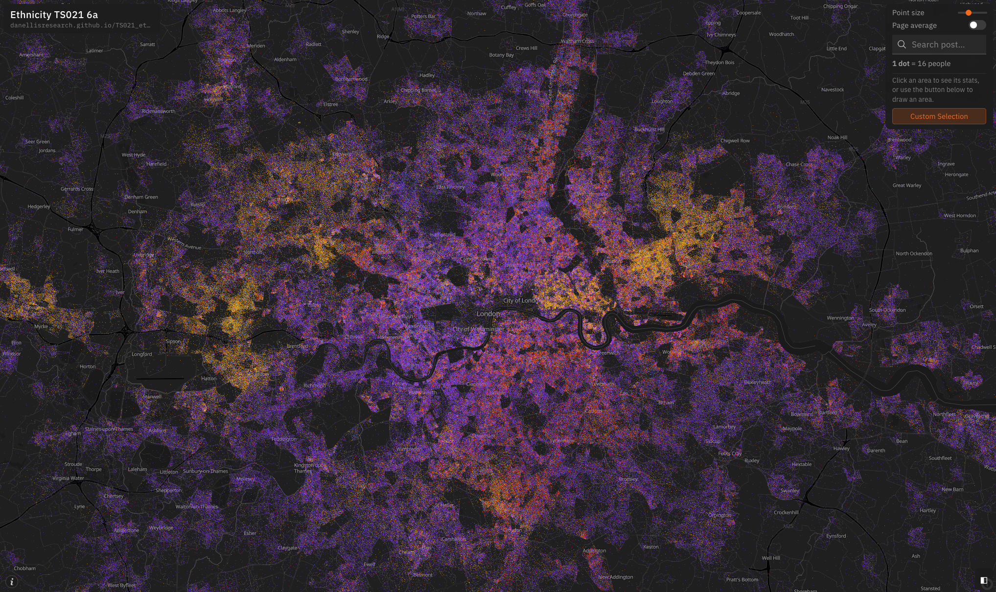
England + Wales, 2021
The finished map renders 56 million people across 188,000 output areas — one dot per 16 people at the default zoom. Five colours represent the five ethnicity categories. The national distribution is immediately legible at city scale: predominantly White across most of England and Wales, with Asian, Black, Mixed, and Other populations concentrated in London, Birmingham, Manchester, Bradford, and Leicester.
The legend updates live as the user clicks, draws, or pans. The data is fixed: a complete snapshot of England and Wales at census day, 21 March 2021.